I’ve made a few big changes to the back end of “Liquid Space” so that the code is more logical and modular and less like something I wrote as a stream of consciousness ramble at 3am. I’m slowly renaming “node” to “card” as I think the idea of index cards is a good metaphor for discrete fragments of web content. Also it’s less scary to people who don’t think in graphs – 99.99% of our potential users!
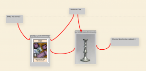
Also, I’ve done is tidied up the code which handles a pasted URL. It now makes a nice little icon with the image of the thing. It’s a bit *too* little, so I’m wondering about altering the icon size from 32x32px, or making it configurable. It’s just metadata inside the card.
I’ve now made it so any information for sub-classes of card is stored in a single bit of the card metadata rather than strewn around as I felt like. This breaks back compatibility of the save files, but now’s an OK time to do that. Also, on advice from more experienced JS coders, I’ve made position & size into objects so it’s now node.data.pos.x and node.data.size.width. Doing these rationalisations early is sensible, I think.
A more subtle change I’ve made (but not yet rolled out) is that zoom is now exponential rather than linear, so it doesn’t act jerky when zoomed out — the jump from 10% to 20% is far more dramatic than from 100% to 110% but that’s what a linear zoom was doing. Now the same action that does 100% to 110% will do 10% to 11% thus giving smooth zoom in/out.
Before the demo day I’d like to add some more features. Drag-to-open is an idea of dragging a link into where you want it to open. I suspect this will be really elegant, and save having to worry so much about a “physics engine” to do layout of the nodes (although there’s no reason not to add one eventually)
At some point I intend to add an “edit link” view to each card to or edit add more information to basic links created by touching cards together, and also even have a few styles of link. I’ve spent a bit of time reading about SVG curves and made this experiment, making things look even more like a “Murderboard” from a detective drama. It made the “arrow” heads all point vertically up though, so more maths may be required… or maybe just cute little pins.

My long term plan is to allow cards to define custom anchor points too, so instead of “nearest edge” you could specify. The link definitions go to and from { node: ‘nodeid’ } with the intention that that data may have more info later. At a basic level you could select compass points, which might be a sensible core option so links can optionally be set to anchor on N, NE, E, etc. But far cooler would be to anchor links on a specific point in an image, or a fragment of text in HTML, a pin on an embedded map, or an event in an interactive timeline. I really love the idea of the link anchors moving as you interact with things, but I have no idea if that’s actually good or not.
Later there should be features that let you query the display, and hide/show cards or links based on metadata. But that’s long term.
Another idea, inspired by Ted Nelson, is to have a link of type “next in dimension” which would have the unique ID for a dimension as metadata of the link. An example of a dimension could be “the posts in this wordpress blog, ordered by creation time”. Then you could select an option on any of the cards in such a sequence to display nicely horizontally, vertically (or other things, they could even spiral from a center point etc.). This would be a way to address bringing large amounts of data into the page and making it manageable quickly. Reordering sets visually in different ways could also provide new insights into how things link together. Maybe. I’d have to try it out.
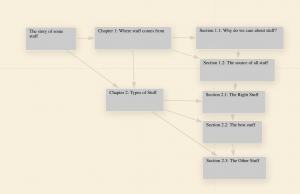
 We could take this a little further and even lay things out in two dimensions. This might be very appropriate for, say, a document described in two dimensions; next element at the same level as this element, and immediate sub element. The dimensions would be specific to this exact instance of this document, as the fragments may exist in other instances of the document in a different order! I suspect that this would do very nice things tied in with Gyuri’s trails tools, and Frode’s author. Especially if we could later have some kind of real time updates from those tools into the display. Another idea of a dimension would be “next post in category ‘JRNL'” so you could line up all the posts in a given category. This would change any time people modified things in the blog, so I would imagine the dimension would be “as of <timestamp>” rather than a timeless ID.
None of these ideas are set in stone, but this is just some current mulling.
2 Comments
Frode Hegland
Beautiful. I would really love it if there was no card when a node had only a subject (short text) rather than long text, since the cards don’t add meaning if they only have a title, they just take up space I think…
Christopher Gutteridge
That’s certainly possible. We still need a cue for resizing, a cue for the card’s “actions menu” and a cue for dragging. However most of those can be hidden until you hover.
Some blog related nodes have no content, comment nodes might have no title. Those are slightly different cases. How would you expect them to look?